OVERVIEW
OVERVIEW
OVERVIEW
Designing a boba shop website to elevate ordering experiences and create appealing branding for customers
Designing a boba shop website to elevate ordering experiences and create appealing branding for customers
Designing a boba shop website to elevate ordering experiences and create appealing branding for customers
ROLE
Designer and Founder
(Web Dev Course)
Designer
Founder
Designer
Founder
SKILLS
HTML & CSS
UI/UX Design
Web Design
Branding
HTML & CSS
UI/UX Design
Web Design
Branding
DURATION
TIME
5 Days
5 Days
TOOLS
Figma
Visual Studio Code
Figma
Visual Studio Code
Boba Fushion is a boba shop that I conceptualized during my web design course as a "client" to design branding and develop a functional website for. The main focus of this project was to practice HTML & CSS which I applied to my design process.
INQUIRY
How can Boba Fushion's in-person branding be reflected in its digital presence?
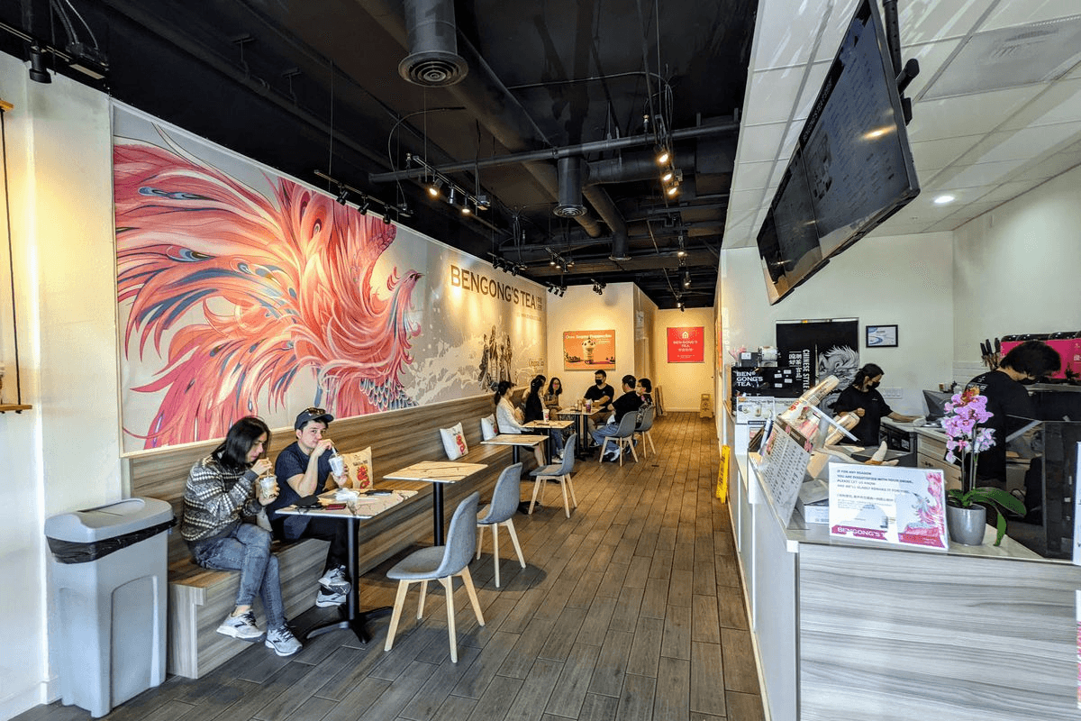
Physical customer experience in boba stores
How does the in-person experience translate to the digital world?
Physical customer experience in boba stores
How does the in-person experience translate to the digital world?
Boba Fushion is a boba shop that I conceptualized during my web design course as a "client" to design branding and develop a functional website for. The main focus of this project was to practice HTML & CSS which I applied to my design process.
INQUIRY
How can Boba Fushion's in-person branding be reflected in its digital presence?
How can Boba Fushion's in-person branding be reflected in its digital presence?
Physical customer experience for in-person boba stores
How does the in-person experience translate to the digital world?
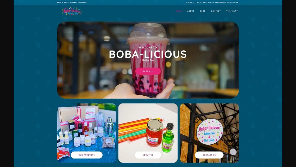
Pros
Clear, dynamic typography
Designated color theme
Effective use of scale
Potential for Growth
Scrolling animation
More contrast to establish recognizable branding
Pros
Eye-catching background
Good contrast of hero image and header
Potential for Growth
Simplify background
Increase usability with CTA (i.e. buy now)
Pros
Clear color theme
Direct CTA: “Buy Now”
Effective use of scale
Potential for Growth
Elevate fonts
Add menu page to simplify ordering experience
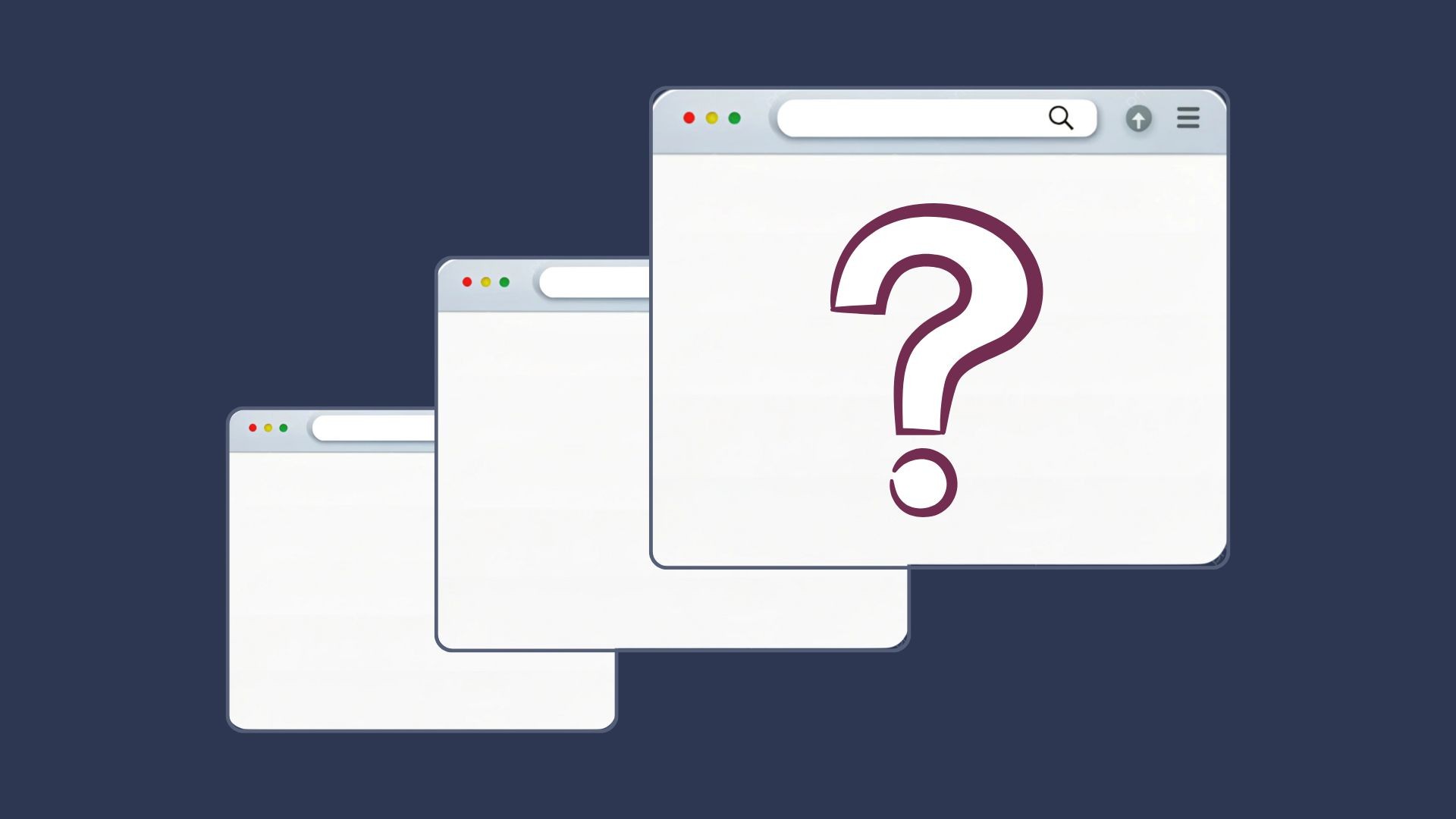
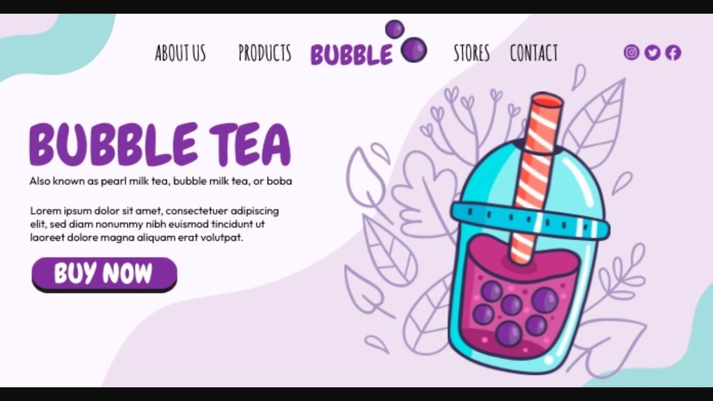
I analyzed three boba shop websites in a similar location and space as Boba Fushion to analyze the effective design choices and identify problem areas that can be improved.
CURRENT MARKET
Most boba shop websites feel cluttered, static, or lacking key information for online orders
Pros
Clear, dynamic typography
Designated color theme
Effective use of scale
Potential for Growth
Scrolling animation
More contrast to establish recognizable branding
Pros
Eye-catching background
Good contrast of hero image and header
Potential for Growth
Simplify background
Increase usability with CTA (i.e. buy now)
Pros
Clear color theme
Direct CTA: “Buy Now”
Effective use of scale
Potential for Growth
Elevate fonts
Add menu page to simplify ordering experience
CURRENT MARKET
Most boba shop websites feel cluttered, static, or lacking key information for online orders
Most boba shop websites feel cluttered, static, or lacking key information for online orders
I analyzed three boba shop websites in a similar location and space as Boba Fushion to analyze the effective design choices and identify problem areas that can be improved.
I analyzed three boba shop websites in a similar location and space as Boba Fushion to analyze the effective design choices and identify problem areas that can be improved.
Pros
Clear, dynamic typography
Designated color theme
Effective use of scale
Potential for Growth
Scrolling animation
More contrast to establish recognizable branding
Pros
Eye-catching background
Good contrast of hero image and header
Potential for Growth
Simplify background
Increase usability with CTA (i.e. buy now)
Pros
Clear color theme
Direct CTA: “Buy Now”
Effective use of scale
Potential for Growth
Elevate fonts
Add menu page to simplify ordering experience
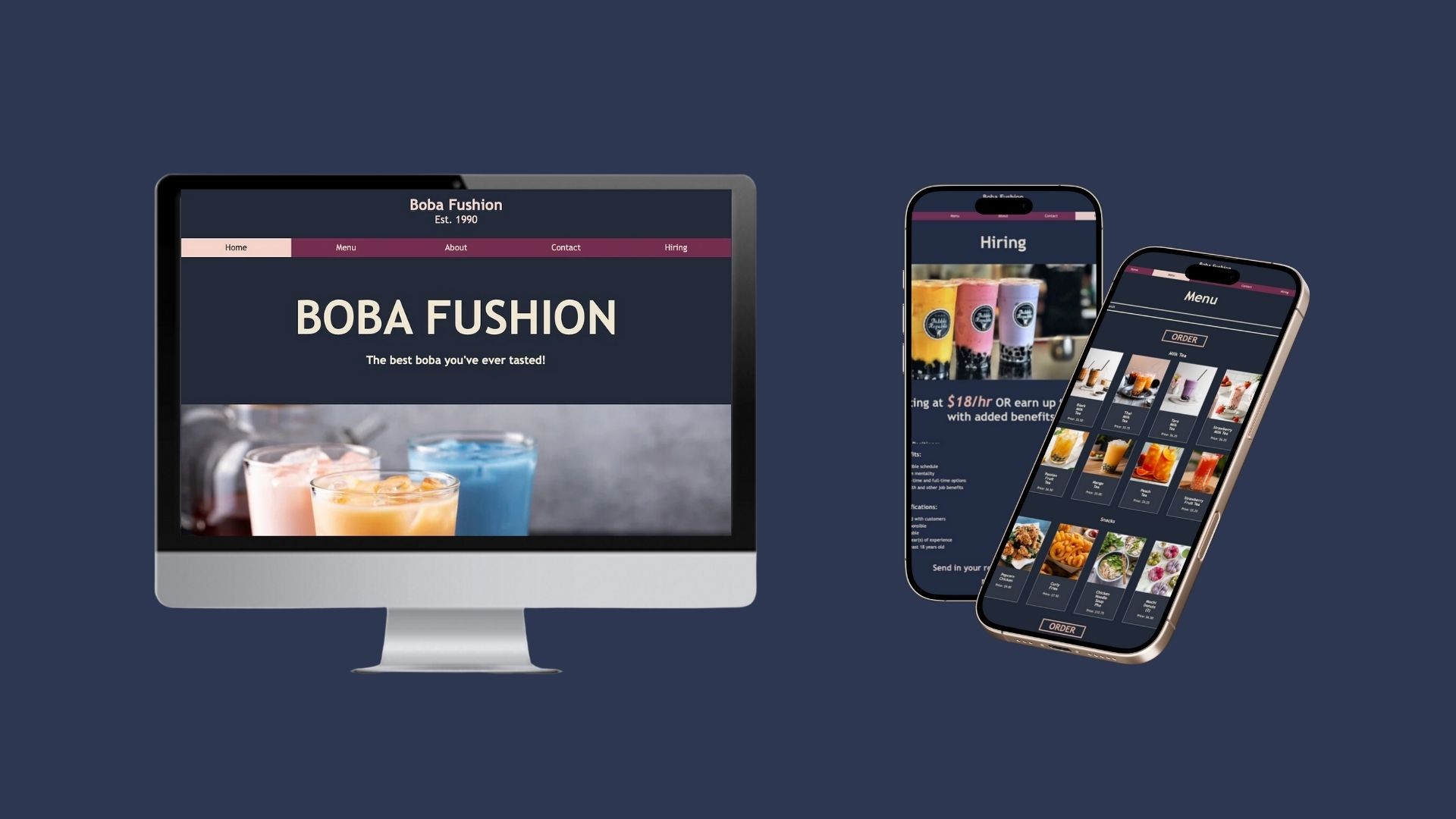
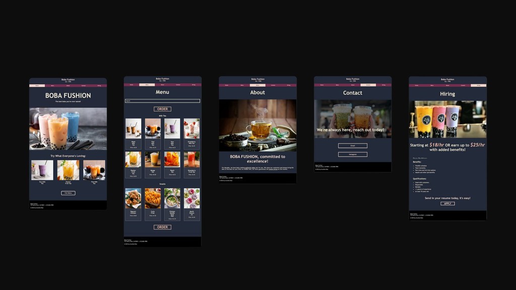
SOLUTION
Boba Fushion Rebrand: bold colors, strategic CTAs, and simplified user experience
Boba Fushion Rebrand: bold colors, strategic CTAs, and simplified user experience
Boba Fushion Rebrand: bold colors, strategic CTAs, and simplified user experience
Final web designs for the Boba Fushion online platform, utilizing useful design choices from existing brands and scaling the strategic placement call-to-actions (CTAs) to increase sales and guide user easibility.
PROCESS
Exploring CTA placement, responsiveness, and menu format for minimal customer friction
Exploring CTA placement, responsiveness, and menu format for minimal customer friction
A streamlined platform for students with the productivity features students know and love, paired with exciting, seamlessly integrated community-building and wellness features to promote balance and growth.
A streamlined platform for students with the productivity features students know and love, paired with exciting, seamlessly integrated community-building and wellness features to promote balance and growth.
Mid-Fidelity Mobile Interface Mockup

Mapping out key features and essential pages for online ordering for clear, frictionless user experience
Mid-Fidelity Desktop Interface Mockup
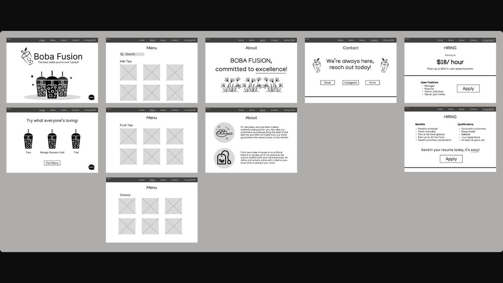
Planning for desktop: redesigning mobile interfaces to be responsive and optimal for desktop viewing and usability
Mid-Fi Fidelity Interactive Figma Interface Prototype
Interactive Figma prototype for desktop to test design assumptions and user design flows
NEXT STEPS
NEXT STEPS
A/B testing to enhance ease of the purchasing process and creating a versatile branding guide
It's important to understand how real users feel about the website at each stage of the design process to ensure it meets the brief of making the purchasing experience for boba more frictionless and easy for consumers. Looking at the bigger picture, a clear branding guide will allow the website design to translate into social media and promotional content seamlessly.
A/B testing to enhance ease of the purchasing process and creating a versatile branding guide
A/B testing to enhance ease of the purchasing process and creating a versatile branding guide
A/B testing to enhance ease of the purchasing process and creating a versatile branding guide
It's important to understand how real users feel about the website at each stage of the design process to ensure it meets the brief of making the purchasing experience for boba more frictionless and easy for consumers. Looking at the bigger picture, a clear branding guide will allow the website design to translate into social media and promotional content seamlessly.